图表图画型
Writing a composition based on a graphic, we should first of all understand the meaning the graph (table) conveys, and then give an accurate and clear description of the graph (table).
The next step is to generalize about the graph (table) — interpret and analyze it.
Finally, we should make a sound conclusion based on the graph (table).
Examples:
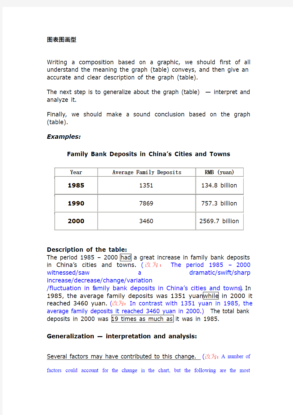
Family Bank Deposits in China’s Cities and Towns
Year Average Family Deposits RMB (yuan)
19851351 134.8 billion
19907869 757.3 billion
20003460 2569.7 billion Description of the table:
The period 1985 – 2000 had a great increase in family bank deposits in China’s cities and towns.(改为:The period 1985 –2000 witnessed/saw a dramatic/swift/sharp increase/decrease/change/variation
/fluctuation in f amily bank deposits in China’s cities and towns.) In 1985, the average family deposits was 1351 yuan while in 2000 it reached 3460 yuan. (改为:In contrast with 1351 yuan in 1985, the average family deposits it reached 3460 yuan in 2000.) The total bank deposits in 2000 was 19 times as much as it was in 1985. Generalization — interpretation and analysis:
Several factors may have contributed to this change. (改为:A number of factors could account for the change in the chart, but the following are the most
critical ones.) (或改为:A number of factors could account for the change in the chart, among which are most critical as follows.)Firstly, the family income has greatly increased and people have more spare money to deposit in the bank. Secondly, people want to deposit money to buy more expensive items such as houses and cars. Thirdly, banks are still thought of as the safest place to deposit money. More and more people are willing to deposit money in banks instead of other investment such as stock exchange and future investment.
Making a sound conclusion:
From the above table we can predict that the family income will continue to increase and that people will have even more money to deposit in the bank.
In a word, this chart is a perfect indicator of
Useful expressions and patterns used for presenting tables or graphics:
Describing graph 1. From the table (graph) it can be seen (shown, calculated) …
2. According to the table (graph) ...
3. X is much ... than Y in ...
4. Compared with ...
Interpreting graph 1. Several factors may contribute to ...
2. One of the causes of ... is ...
3. One consequence of ... is ...
Conclusion from graph 1. In conclusion, we can / may say
that ... 2. Finally, it can / may be said that ... 3. Therefore, it can be concluded ...
2003年6月
Directions: For this part, you are allowed 30 minutes to write a composition on the
topic Changes in the Ownership of Houses in China. You should write
at least 150 words and you should base your composition on the graph
and outline below.
0%
20%
40%
60%
80%
100%
1950’s 1970’s 1990’s state-owned private
1. Describe the changes as indicated by the graph
2. Give possible reasons for the changes
Changes in the Ownership of Houses in China
It can be seen from the chart that there have been dramatic changes in the ownership of houses in China in the past 50 years. While the percentage of state-owned houses has dropped from 70% in 1950’s to 20% in 1990’s, that of private houses has soared from 30% to 80% during the same period of time.
A number of factors could account for the change in the chart, but the following are the most critical ones. First, thanks to the policy of reform and opening-up, the
nation’s economy has been developing at a considerably high speed in the past decades. Therefore, people have more extra money to improve their housing. Secondly, other relevant state policies and the boom of real estate industry provide citizens with more opportunities to choose their own dwelling places. Last but not least, people have attached greater importance to their quality of life. Thus, more of them have purchased houses in their own favor.
In a word, this chart is a perfect indicator of China’s fast expanding economy and people’s rising standard of life. Although a series of problems have arisen in the process, it is reasonable for us to believe that they can be solved in the near future with effective measures taken by both the government and the public.
Health Gains in Developing Countries
It can be seen from the chart that there have been dramatic changes in life expectancy and infant mortality in developing countries in the past decades. As the chart shows, people’s life expectancy soared from 40 years old to 60 years old from 1960 to 1990. Meanwhile, infant mortality declined from 200 to 150 deaths per thousand births.
The change in the chart may be attributed to a number of factors, but the following are the most critical ones. First, developing countries’ economy has been developing at a considerably high speed in the past decades. Therefore, people have more extra money to improve their health. Secondly, the advances in medical sciences and boom of medical industry provide citizens with more opportunities to cure their diseases. Last but not least, people have attached greater importance to their quality of life, thus they have spent more money and time to build up their bodies.
In a word, this chart is a perfect indicator of developing nations’ fast expanding economy and people’s rising standard of life. Although a series of problems have arisen in the process, it is reasonable for us to believe that they can be solved in the near future with effective measures taken by both the government and the public.
(或If this trend continues, developing countries will soon approach the developed countries in terms of health care. People will live longer and healthier lives. The result of this will be happier and more productive populations.)
1991年6月
Directions:For this part, you are allowed 30 minutes to write a composition based on the graph below.
The suggested title is: Car Accidents Declining in Walton City. Remember that your composition must be written according to the following outline:
1. Rise and fall of the rate of car accidents as indicated by the graph;
2. Possible reason(s) for the decline of car accidents in the city;
3. Your predictions of what will happen this year.
Your composition should be no less than 120 words and you should quote as few
figures as possible.
图表类英语作文范文英语作文模板(图表类的)这里很全 一、图表类作文常用的单词、短语和句型 1.表示数据变化的单词或短语 in the case of (在……的情况下) in terms of (在……方面) increase / raise / rise / go up(增加) decrease / grow down / drop / fall (减少) increased by (增长了) increased to (增长到) the number sharply goes up to(数字急剧上升至)
significant(重大的),steady(平稳的),gradual(逐渐的),slow(慢慢的),stable(稳定的),rapid(快速的)…… 2. 表示从图表得知的信息的句型 The table / chart / graph shows that...(这个图表告诉我们……) Aording to the table / chart /graph, we can see that...(根据图表,我们可以看出……) It can be concluded from the graph that...(从图表中可以得出……) The table shows the changes in the number of...over the period from...to...(该表格描述了在……期间……数量的变化) 二、图表类作文的模式
图表类作文中的图表主要有以下形式:柱形图类(chart)、圆饼图类(pie chart)、曲线图类(line chart)、表格类(table)。写文章时,首先要对图表加以描述,而后引出主题加以讨论,最后得出结论,也就是按照描述图表—解释原因—下结论的步骤来写。切忌对图表不作交代就直接谈论主题。 1.表格类作文的模式 表格类作文一般可以分为三段:第一段对表格中的数据进行描述,只要抓住变化规律即可,切忌一一列举数据;第二段说明变化的原因;第三段得出结论。即: (1) Studying the table carefully, we can see...(仔细研读表格,我们可以看出……) (2) In my opinion, the reasons why...are as follows. Firstly...Secondly...Thirdly...(在我看来,为什么……的原因在于以下几点:第一……第二……第三……)
第一段3句 1总体描述:1句 1.As is vividly/symbolically depicted in the picture/cartoon ,we can notice that____ As is vividly(subtly/symbolically)depicted (shown/described/revealed/portrayed /demonstrted/illustrated)in the photo(caricature/carton/drawing/picture/ photograph)above______________________________________ Having captured our attention,the picture vividly betrays the fact (表现出事实)that___ This set of drawing vividly reflects the fact that____(一组图) 2细节描述1-2句 3文字说明/象征寓意: (1)文字说明: 会写的话:The picture is captioned “________ ”,which indicates that_______ 文字不会写的话:The caption reads that___________ (2)象征寓意:It is apparent that 第二段5句左右 论证部分: At first thought ,people may consider _____.But deeper thinking leads us to its core meaning___ 1主题句1句:(中心) (1)The purpose of the picture is to tell us that_____保护环境保护传统文化_____is of great significance to us human. (2)This picture dose reflect a thought-provoking social phenomenon which is not uncommon in China now that___社会现象____ (3)However,the man in the picture ,who_____,is not an isolated example._社会风气_is a problem pervasive throughout our society。 (4)A life philosophy is clearly reflected above that__人生哲理____. (5)The purpose of the picture is to tell us that it is impretive to_____ (6)Among the topic concerning __象征寓意____,as the depiction shows,the most cardinal top is related to the issue of ___象征寓意具体化____。 (在_____画题中,正如漫画所给,最核心的点是_______。) (7)Undoubtedly , through the thought-provoking illustration,the drawer aims at reminding us the significance of_____(强调重要性) (8)Through the incentive illustration ,the drawer aims to point out the advantanges and disadantages of______(有好有坏的)、 (9)The recent a few years has witnessed a phenomenon of 主题(不好的现象)which seems to be disastrous to individual survival and prosperity. 对我们的生存和社会的繁荣造成影响 论证部分:
第一部分、写作模板——图表式作文 It is obvious in the graphic/table that the rate/number/amount of Y has undergone dramatic changes. It has gone up/grown/fallen/dropped considerably in recent years (as X varies). At the point of X1, Y reaches its peak of …(多少). What is the reason for this change? Mainly there are …(多少) reasons behind the situation reflected in the graphic/table. First of all, …(第一个原因). More importantly, …(第二个原因). Most important of all, …(第三个原因). From the above discussions, we have enough reason to predict what will happen in the near future. The trend described in the graphic/table will continue for quite a long time (if necessary measures are not taken括号里的使用于那些不太好的变化趋势). 第二部分、写作模板——提纲式作文 一、说明原因型 模块(一) Nowadays , there are more and more XX in some big cities . It is estimated that ( 1 ). Why have there been so many XX ? Maybe the reasons can be listed as follows. The first one is that ( 2 ) .Besides, ( 3 ) . The third reason is ( 4 ). To sum up , the main cause of XX is due to ( 5 ) . It is high time that something were done upon it. For one thing , ( 6 ). On the other hand , ( 7 ). All these measures will certainly reduce the number of XX . 注释: (1)用具体数据说明XX现象; (2)原因一; (3)原因二; (4)原因三 (5)指出主要原因;
图表的英文描述: 图表的种类: 饼状图 pie chart/pie graph segment 柱形图 bar chart/bar graph bar 线型/曲线图 line chart/line graph line线条实线solid line 虚线dotted line 横轴 horizontal axis竖轴vertical axis 表格 table行row 列column 常用的表达: 比例percentage percent 5% five percent 数量 number 趋势 trend 关系 relation This is a pie chart/bar chart/line chart/table of_________. 这是一个关于________的饼状图/柱形图/线型图/表格。 This pie chart/bar chart/line chart/table shows________ 这张图展示了___________. From this pie chart/bar chart/line chart/table, we can see/ know that_____________. 从这张图中,我们知道___________. As we can see from the pie chart/bar chart/line chart/table, ____________________. 我们可以从这张图中知道,________________________________. 在这张曲线图中,横轴代表_________________,竖轴代表___________________. In this line chart, the horizon tal axis stands for_________, the vertical axis stands for _____________. 比较:比较级+than 大 big/large 更大 bigger/larger 最大the biggest/largest 多 more 快 fast/rapid 更快faster/more rapidly 最快the fastest/the most rapid 高 high 更高 higher 最高the highest 好 good 更好 better 最好 the best Compared with_______, ___________________________. 同_______相比,________________. 例:同A相比,B的数量比A更多。Compared with A, the number of B is larger than the number of A. 同A相比,B增长得更快。Compared with A, B increases faster. 变化: 变化速度:快地fast/rapidly 慢地slowly 稳定地stably 变化程度:大(剧烈)dramatic ally 小(轻微)s light ly 改变change 增加 grow/increase/ go up 减少decrease/go down 无变化 have no change/ stay the same 描述、分析图表的主要步骤:
2020高考英语作文写作模板篇一 图画作文模板 As is vividly shown in the picture, .(描述图画内容)The picture/cartoon informs us of the phenomenon that .(图画反映的现象) These may/might be several factors contributing to/responsible for the phenomenon/problem. To start with, . Sec ondly, . What’s more, . Last but not least, .(说明原因) In my opinion, the government/the school/we should take measures to/something must be done to . Only in this way can the problem be really Only when everyone can do so will our world become more and more beautiful.(解决问题的方法) 延伸阅读:其他优秀模板两篇 2020高考英语作文写作模板篇二 利弊对比型议论文模板 Nowadays, there is a widespread concern over .(引出话题或对象) In fact, there are both advantages and disadvantages in . Generally speaking, it is widely believed that there are several positive aspects as follows. Firstly, .(优点一)And secondly, .(优点二) Just as a popular saying goes, "Every coin has two sides." is no exception, and in other words, it still has negative aspects. To begin with, .(缺点一)In addition, .(缺点二) To sum up, we should try to bring the advantages of into full play, and reduce the disadvantages to the minimum at the same time. In that case, we will definitely make a better use of .(总结) 2020高考英语作文写作模板篇三 正反观点对比型议论文模板 There is a widespread concern over the issue that . But it is well known that the opinion concerning this hot topic varies from person to person.(引出话题)
图表类英语作文范文 图表类型的英语写作如果不擅于观察漫画的话,作文写出来可能会偏题。下面是小编给大家带来图表类英语作文,供大家参阅! 图表类英语作文范文篇1第一段:说明图表 开篇句:As the bar chart shows, ____ during the years of ____to____. 扩展句:1、As early as _____. 2、Then _____ years later, ____. 3、And arriving in the year ____, ____. 第二段:解释图表变化原因 主题句:Several factors contribute to _____. 扩展句:1、______. (原因1) 2、And ______.(原因2) 3、Furthermore, ______ (原因3) 4、All these result in ____. 第三段:提出解决办法 结尾句:However, ____ is faced with some problems. 扩展句:1、With _____, ____, the effect of which is not only discouraging, but also challenging. 2、So my principle is to pay due attention to ___, but not
justto____. 示范 第一段:说明图表 开篇句:As the bar chart shows, the number of people below the poverty line decreased dramatically during the years of 1978 to1997. 扩展句:1、As early as 1978, about 250 million people were under the poverty line. 2、Then seven years later, the number became three fifths thatof1978. 3、And arriving in the year 1997, the number was reduced to50millions. 第二段:解释图表变化原因 主题句:Several factors contribute to the sharp decrease of the below-poverty population. 扩展句:1、The reform and opening following 1978 enabled the peasants to become much better off. (原因1) 2、And with the development of Chinese economy, that policy also improved city dwellers lives greatly. (原因2) 3、Furthermore, the high-tech introduced made it possible for the countrys economy as a whole to take off. (原因3) 4、All these result in the great fall of the
1.Map(地图、天体图、布局图、专用图、图谱)Battle map 作战地图 Highway map 公路图 Genetic map 基因图谱 2.Figure(图形、平面图) Geometric(al) figure 几何图形 Dimension figure 尺寸图 Plane figure 平面图 3.Pattern(图案、图型、图样) Checkboard pattern 棋盘型图案 Recording pattern 录像图型 Circular pattern 圆形图样 4.Sketch(草图、略图、简图) Eye sketch 目测草图 Topographic sketch 地形略图 Dimensional sketch 尺寸简图 5.Scheme/shematic(图解、示意图、流程图、电路图)Flow scheme 流程图 Induction scheme 感应电路图 6.Draft(草图) Chisel draft 雕刻前在石头上画出边缘轮廓草图 7.Curve(曲线图表) Algebraic curve 代数曲线 Comfort curve 湿度舒适曲线 8.Graph(曲线图表) Funtional graph 函数图(亦称plot) Bar graph 条形图(也称chart) 9.View(视图) Plane view 平面视图 10.Geometry(几何图) Plane geometry 平面几何 Solid geometry 立体几何图 11.Chart(航海图、图表) Aeronautical chart 领航图 Demographic data chart 人口统计图表 Pie chart 饼图 Bar chart 柱图 12.Drawing(工程图、插图) Drawing 建筑图 Explanatory drawing 说明(插)图 https://www.doczj.com/doc/389501895.html,yout(布局图、规划图) 1、图形种类及概述法: 泛指一份数据图表:
图表分析型英语作文Sample 1 More Candidates for Civil Servants 1.根据下图描述报考公务员人数变化的趋势 2.分析导致这种趋势的原因 3.你的建议 1,000,000 2003 2004 2005 As is shown in the bar chart, the number of applicants for civil servants has increased abruptly—by about 10 times, from 100,000 in 2003 to 1,000,000 in 2005. Several factors may contribute to the rush. First and foremost, working as civil servants in China is relatively stable, and Chinese people have a traditional preference for maintaining a life-long career. The rising interest could also be attributed to the unique social status. Comparatively speaking , civil servants are generally highly respected by common people in China. Last, we should not neglect the benefits such as the welfare in government departments. Compared with the striking number of applicants for becoming civil servants, the vacancies issued by the government are scarce. Thus, it is suggested that applicants should weigh their own advantages and
图表作文(一) 第一节图表作文的类型 图表作文可分为两大类:表作文和图作文。 表作文 表格(Table)可以使大量数据系统化,便于阅读、比较。表格常由标题(Title)、表头(Boxhead)(表格的第一行)、侧目(Stub)(表格左边的第一列)和主体(Body)部分(表格的其余部分)等部分组成。如下表: 用表格表达的信息具体准确,而且表格中的各项均按一定规律排列。阅读表格时要注意找出表格中各个项目的相互关系,表格中各个项目的变化规律。例如,上面的表格中的数字说明,和1978年相比,1983年大学入学的人数在增加,而小学的入学人数在减少。搞清楚这些变化规律也就读懂了表格的内容。 图作文 图作文又可分为三种:圆形图作文、曲线图作文和条状图作文。 (1) 圆形图作文 圆形图(Pie chart)也称为饼状图或圆面分割图。圆形图因为比较形象和直观,各部分空间大小差别容易分辨,所以常用来表示总量和各分量之间的百分比关系。整个圆表示总量,楔形块表示分量。有时圆形图还有数值表,两者结合可把各分量表示得更准确、清楚。例如:This is a pie chart of the average weekly expenditure of a family in Great Britain. As can be see from the chart, the main expenditure of an average British family is spent on food, which accounts for 25% of its total expenditure. The next two significant expending items are transport and housing, which are 15% and 12% respectively. If we take into account clothing and footwear, which makes up 10%, the four essentials of life, that is, food, transport, housing, and clothing and footwear, amount to 62% of the total expenditure. (2) 曲线图作文 曲线图(Line graph)也称为线性图或坐标图。曲线图最适合表示两个变量之间关系的发展过程和趋势。一般来说,曲线所呈现的形状比某一点所代表的变量的值更有意义。曲线图有横轴和纵轴。一般先看横轴所代表的数量或时间等,然后再看纵轴所显示的意义。同时必须找出线条所反映的最高或最低的变化。例如: 这个曲线图的横轴代表1990年的不同的月份,纵轴代表交通事故的数量。从交通事故曲线图上可知,前八个月的交通事故的数量有升有降。曲线图在八月份升到了最高点(39),此后一直呈下降的趋势,十二月份降到了最低点(16)。可见,1990年的交通事故的数量总体上呈下降的趋势。 (3) 条形图作文 条形图(Bar graph)也称为立柱图或圆柱图。条形图由宽度相同但长度不同的条块代表不同的量。当要比较几个项目或量时,常用不同颜色来区分。条形图主要用来表示:1)同一项目在不同时间的量;2)同一时间不同项目的量。阅读条形图时,要先看图例,再看横轴、纵横各代表什么量,每一个刻度所代表的值是多少,最后找出图中各长条所表示的数据及各长条间的相互关系。例如: 左边的条形图的横轴代表时间,纵轴代表期望寿命(Life Expectancy),这一条形图想要体现的是同一项目(期望寿命)在不同时间的量。右边的条形图的横轴也是代表时间,纵轴是代表婴儿的死亡率(Infant Mortality),这一条形图想要体现的也是同一项目(婴儿的死亡率)在不同时间的量。左边的条形图表明1990年的人均期望寿命比1960年的人均期望寿命长20岁,而1990年的婴儿死亡率比1960年的婴儿死亡率下降了50%。
图表分析作文1 As is clearly shown in the table/ figure/ graph / chart, 图表总体描述between 年代and 年代. Especially, 突出的数据变化. There are three reasons for 具体表示急剧上升、下降或特殊现象的词. To begin with, 原因一. In addition / Moreover, 原因二. For example, 具体例证. Last but no least, 原因三. In short,总结上文. As far as I am concerned, / For my part, / As for me,作者自己的观点. On the one hand, 理由一. On the other hand, 理由二. In brief,总结上文. 图表分析作文2 The table / figure / graph / chart shows that 图表总述from 年代to年代. It is self-evident that 突出的数据变化. Three possible reasons contribute to 具体表示急剧上升、下降或特殊现象的词或代词代替上文内容. One reason is that原因一. Another reason is that原因二. For instance,举例证. What’s more原因三. As a result, 重述上文之趋势. However, in my opinion 作者观点. For one thing,理由一. For another, 理由二. To sum up,总结上文. 图表分析作文3 It can be seen from the table / figure / graph / chart that图表总述between年代and年代. Especially,突出的数据变化. Why are there such great changes during 图表涉及的年头数years? There are mainly two reasons explaining具体表示急剧上升、下降或特殊现象的词或代词代替上文内容. First,原因一. In the old days,比较法说明过去的情况. But now,说明现在的情况. Second,原因二. As a result,总结上文. In my viewpoint,作者自己的观点. On the one hand,论点一. On the other hand,论点二. 图表分析作文4 As the table / figure / graph / chart shows,图表总述in the past years年代. Obviously,突出的数据变化. Why are there such sharp contrasts during 图表涉及的年头years? Two main factors contribute to具体表示急剧上升、下降或特殊现象的词或代词代替上文内容. First of all,原因一. In the past,比较法说明过去的情况. But now 说明现在的情况. Moreover,原因二. Therefore,总结上文. As I see it,作者自己的观点. For one thing,论点一. For another,论点二. 图表作文补充句型 ?As is shown in the graph… 如图所示… ?The graph shows that… 图表显示… ?As can be seen from the table,… 从表格中可以看出… ?From the chart, we know that… 从这张表中,我们可知… ?All these data clearly prove the fact that… 所有这些数据明显证明这一事实,即… ?The increase of …. In the city has reached to 20%. ….在这个城市的增长已达到20%. ?In 1985, the number remained the same. 1985年,这个数字保持不变. ?There was a gradual decline in 1989. 1989年,出现了逐渐下降的情况.
As can be seen from the table given above, popular fiction is most popular with Chinese students, accounting for 65.9% of book circulation in the library. General Nonfiction takes up 18.2%, while books concerning science, technology and education, only 10.8%. In contrast, books of art, literature and poetry only have a circulation of 5.1%. Several reasons contribute to their reading preferences. Firstly, popular fiction is fascinating to the young students. Secondly, books about science and technology are usually too complex and difficult to read. They often contain many special terms which most students can’t understand. Finally, in today’s market economy, much more emphasis is laid on practical and vocational books rather than art or poetry. When it comes to me, poetry and art are my favorites. Such kind of books can nourish my mind, broaden my horizons and render me a fresh feeling. Reading a piece of good poetry tends to relieve my burden, and lessen my tension, making me more creative and dynamic. It gets me into an imaginary world, fresh and beautiful. I just love that feeling!(179 words) My View on Reading Extensively Nowadays few of us read extensively after we leave school. This tendency is rather disturbing, for one should know that reading extensively are no less necessary to one’s mental life than fresh air to one’s physical life. From reading extensively, we can derive companionship, experience and instruction. First and foremost, a good book is our faithful friend. It can increase our contentment when we are cheerful and happy, and lessen our pain when we are sad or lonely. Furthermore, reading extensively can also offer us a wide range of experiences. In reading we may join tourists marveling at incredible power of Niagara Falls, mingle with the happy throngs strolling in the Paris boulevards and experience the bitterness or joy of people in different lands and in different times. Few of us can travel far from home or live long over one hundred, but all of us can live many lives through the pages of books. The last but not the least, reading extensively can increase our intellectual ability, broaden our minds and make us wise. Though with the advent of TV and Internet, books are no longer read as extensively as they once were, nothing can replace the role that reading extensively plays in our lives. (206 words) It is obvious in the graph/table that the rate/number/amount of Y has undergone dramatic changes. It has gone up/grown/fallen/dropped considerably in recent years (as X varies). At the point of (接近)X1, Y reaches its peak value of …(多少). What is the reason for this change? Mainly there are … (多少) reasons behind the situation reflected in the graphic/table. First of all, …(第一个原因). More importantly, …(第二个原因). Most impo rtant of all, …(第三个原因). From the above discussions, we have enough reason to predict what will happen in the near future. The trend described in the graph/table will continue for quite a long time (if necessary measures are not taken括号里的使用于那些不太好的变化趋势). 图表作文经典句型总结
图画作文 1. 题型简介:看图作文是借助于图画或图表进行写作的一种文体。它要求作者将画面直观的内容或图片包含的信息转换成传神表意的文字形式,属于说明文性质。其目的是考察考生的观察分析能力、想象力和语言表达能力。作文的命题模式基本如下:给出标题、图画或图表、写作提纲、半小时内写出一篇120-180字左右的评论性文章。 看图作文要求:(1)主题明确,即能概括画面或图表所反映的中心议题;(2)图文一致,即要包括画面或图表中所反映的主要内容。 2. 写作方法: 2.1图画作文实质上就是描述、分析并评论一幅(或一组)图所反映的社会现象。对图画进行描述时,一般以被观察者为对象,联系图片中所包含的背景、插入的文字等,揣摩作者的绘画意图,以观众的口吻进行解说。如果看的是一组图画,就得按照图示的顺序,对画面上的内容进行整体分析,去除细枝末节,分清主次,抓住图画后隐藏的中心意思进行解说。切莫象记流水帐一样把所看到的、想到的细节全部写出来,这只会使读者感到乏味无趣。想象你自己就是这位画家,在画这副画之前,你首先要构思画的内容;其次是构思作画的步骤,先画什么,后画什么;然后将你的构思用文字叙述出来,你对该图画的描述就完成了。 2.2大体框架(具体按照写作要求进行调整): 1)第一段主要是描述图画中的信息和表达的含义。 2)第二段的全文的重点,一般都是要求具体分析图画中暗含的社会现象。 3)第三段的要求一般视具体的试题而定,有的要求给出自己的评论、有的要求举例、有的要求考生提出自己的建议以及针对现象应该采取的措施。 Tips:第二段和第三段的开头最好写一个主题句,既可以防止离题,又符合英文写作的习惯。 2.3 基本结构(具体按照写作要求进行调整) 第一段:引言/起始/淘金段,图画描述,3-4句 1. 总体描述:人物/动物/事物+动作+环境 1句 2. 挖掘细节词、串连成句:1-2句
How People Spent Their Holidays As can be seen from the table, the past decade have witnessed dramatic changes in the way people spent their holiday between 1990 and 2000.In 1990, 63% of people spent their holidays at home, while the figure dropped considerably to 24% in 2000. It is obvious from the table that people tended to be more and more mobile, and they wanted to get entertainment in the outside world. What contributed to these changes? I think the reasons are as follows. To start with, with the rapid development of economy, people earn by far more money than they used to. Thus, people are able to afford traveling expenses. Secondly, people think it important to get well-informed about the outside world in this new era when everything is on the move. Traveling, of course, is a sure way to achieve this goal. What's more, in this competitive society, people are usually under great stress. However, it is not difficult to find traveling an effective way to relieve people's stress and get relaxation. Last but not least, by traveling outside, people are close to nature, which is not only beneficial to both their health and peace of mind. In conclusion, people prefer to go traveling rather than stay at home during holidays for a combination of reasons. Moreover, it seems that this trend will last in the foreseeable future. 人口增长对野生动物的影响(99年真题) [2.图画/图表描述段] From these graphs, we can draw a conclusion that, with the gro wth of human population, the number of species has decreased rapidly in America, and so me species have even vanished from our planet. [6.原因列军段]Why does this phenomenon appear? There are several possible reasons for this. Above all, as the human population grows rapidly, a growing number of people came to live where some wild species have been living. Then these species have to mov